3.3 Exploration Mode
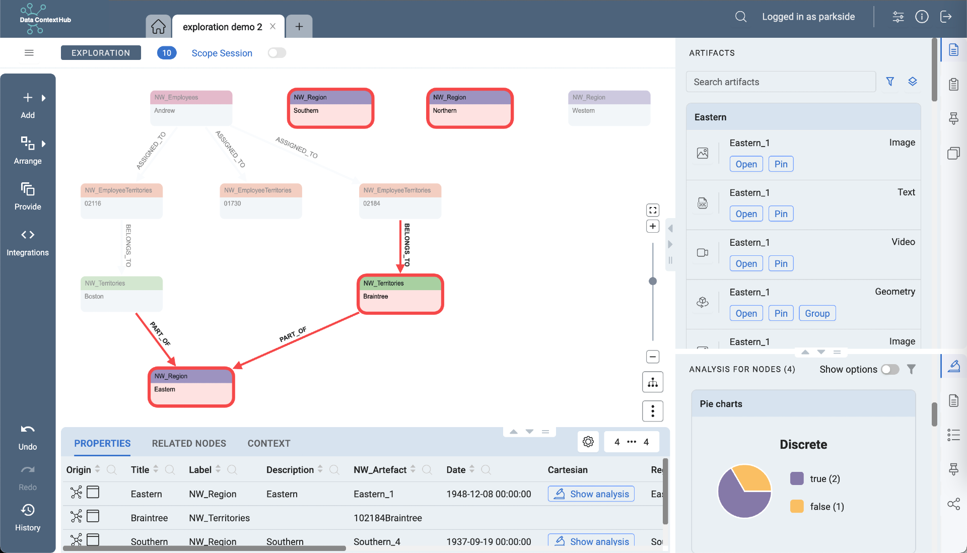
In Exploration Mode you can browse the graph data, add nodes, find their related nodes and filter them based on their properties. Several menus and panels provide further interaction possibilities and insight into the data of selected nodes. After an overview of available menus and panels, each will be explained in more detail.
Overview of Menus and Panels
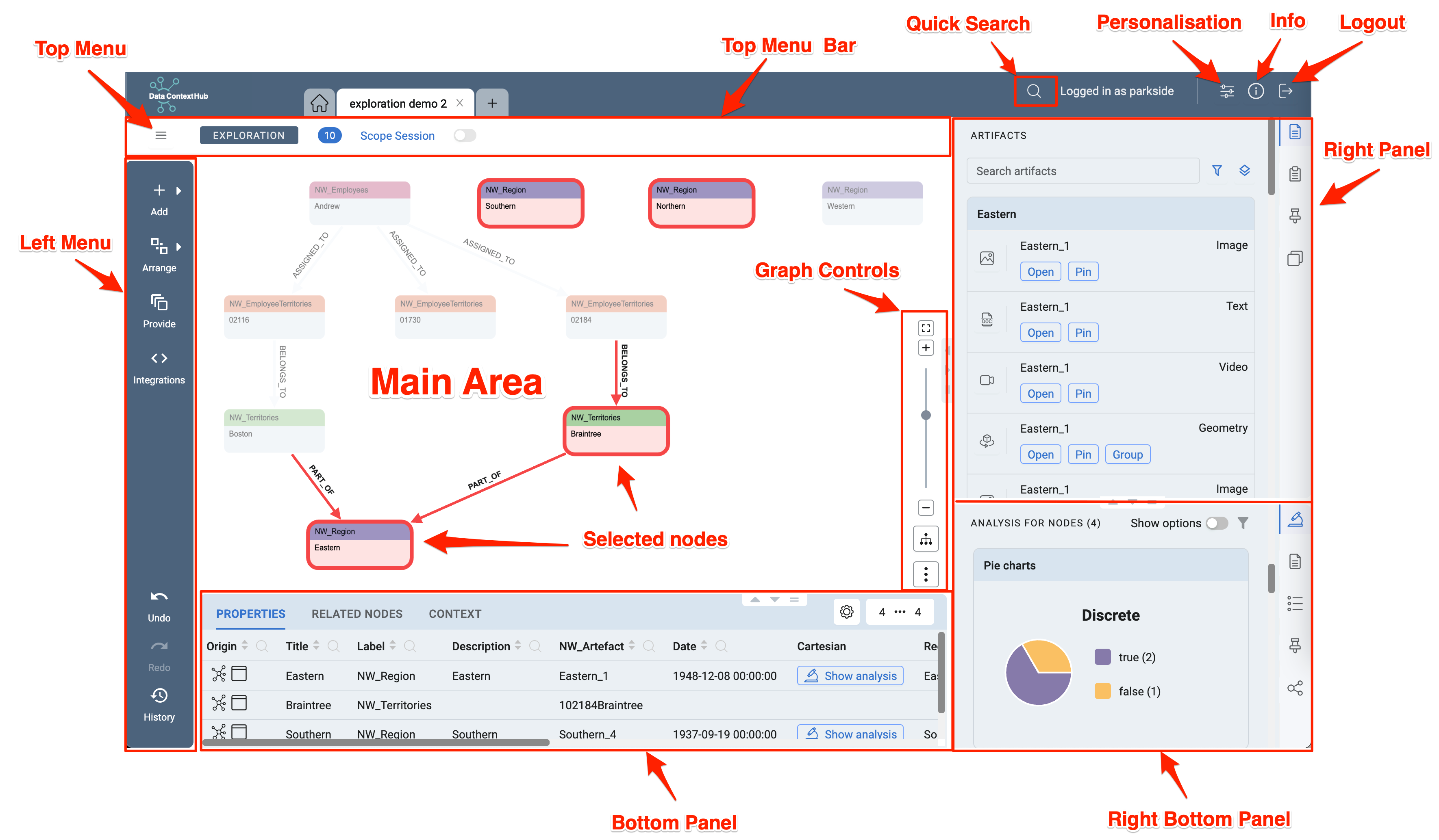
The previous graphic displays the location and look of menus and panels which are subesequently described. The Left Menu alters visible nodes, while the Top Menu is used to save and rename the session. In the Top Menu Banner stats for the displayed nodes and restriction for the dataset can be set. The Right and Bottom Panels focus on providing further information about the selected nodes, which are visible in the Main Area of the Application.
Left Menu
The Left Menu is the starting point for exploring the graph. From here most operations can be performed. There are two types of buttons in the Left Menu, buttons which open a submenu marked by a small arrow to the right and buttons which open a menu directly or perform actions immediately.
Buttons and submenus will be disabled if the action is not possible, for example if no nodes are selected.
Actions that will affect the number of nodes in the graph (adding or removing) will create a history entry and can be undone. More details about History.
Add Nodes
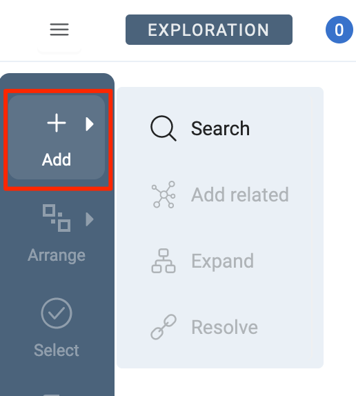
All operations in this menu will add data in the form of nodes and edges to the graph. If you start a new Exploration Session or no nodes are selected, only the Search Menu will be available, all other options will be disabled.
Search
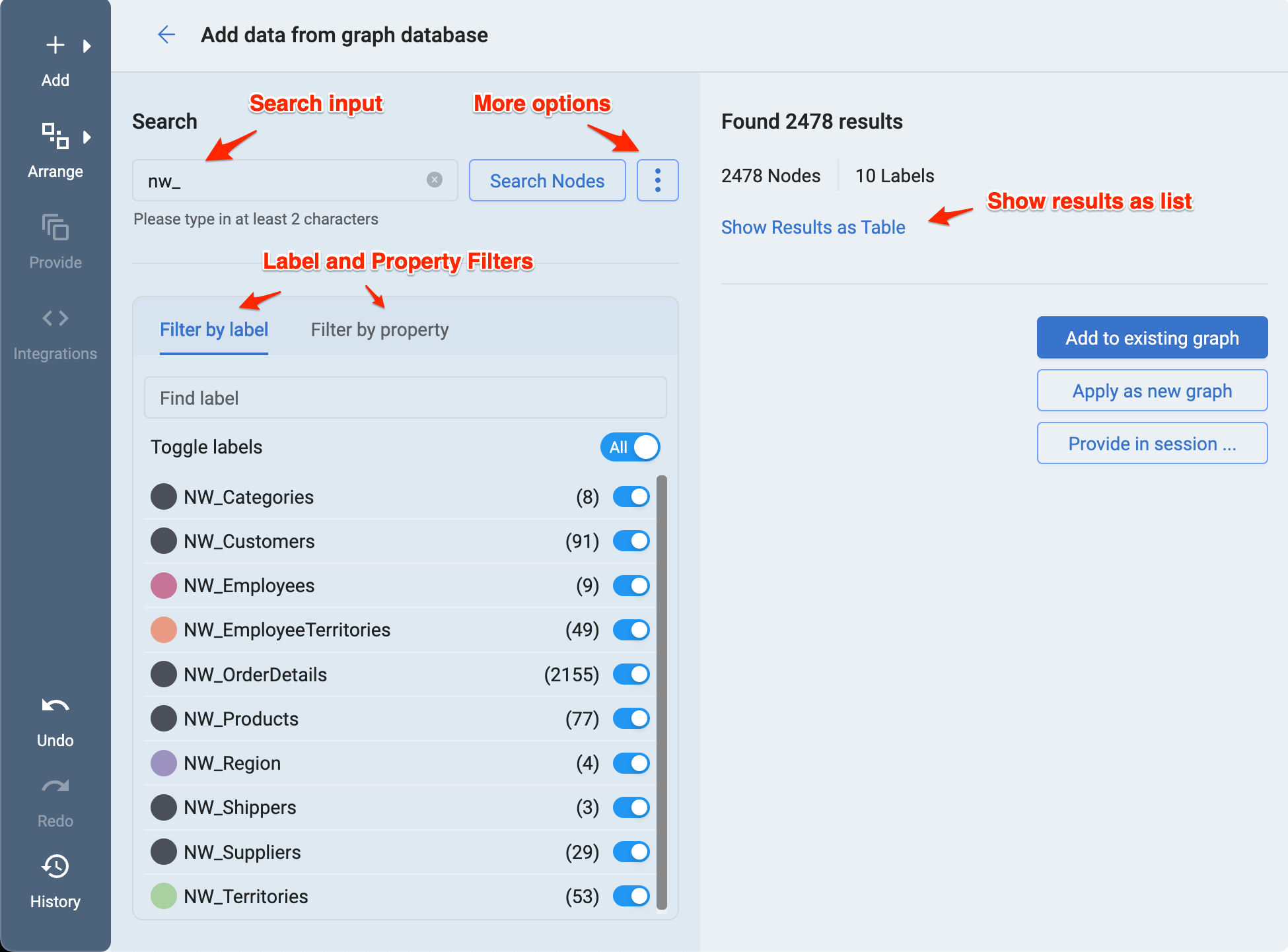
Search is a submenu of Add where you can query the graph for nodes with a term of at least two characters. Any search will query for all properties of the whole graph database, therefore you can get a very large number of results if the search term is either too short or too unspecific. Press the three vertical points More options button, right to Search Nodes to further refine your search query.
Info: When you search for two characters the system will exactly match the search term to limit results. You have to type in three or more characters to perform a more general search.
Once you have performed a search, you can either apply the results directly or use the Label or Property Filters to limit the number of nodes displayed in the graph.
To switch between Label and Property Filters, click on the tab for each filter.
- Filter by label provides a quick way to filter nodes by labels.
- Filter by property filters each node property that can be filtered. Depending on the type of the property different input fields will be available (eg. Date Picker). For text properties, a button left to the input field will switch between exactly matching the filter term or not.
Show results as Table will provide a table of nodes matching the search and filter criteria, these can be individually selected or deselected.
There are three options to apply search results.
- Add to existing graph will add the nodes to the existing nodes in the graph.
- Apply as new graph will remove the current nodes in the graph and add new ones instead.
- Provide in session ... will open an embedded version of the Provide Nodes Menu.
Add Related Nodes
To enable the menu, you have to select nodes in the graph. Once the menu is opened, nodes connected to the selected ones will be fetched from the graph database. You can use the slider to increase the sensitivity to get more results. For example, a sensitivity of 3 means that the furthest nodes found will be connected by 3 edges.
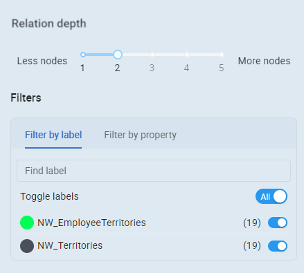
Filtering and applying nodes works similar to the Search Menu.
Expand nodes
The Submenu of Add, Expand, adds nodes is a direct action and just a quick version of the Add related Nodes menu. It will add related nodes with a sensitivity of 1.
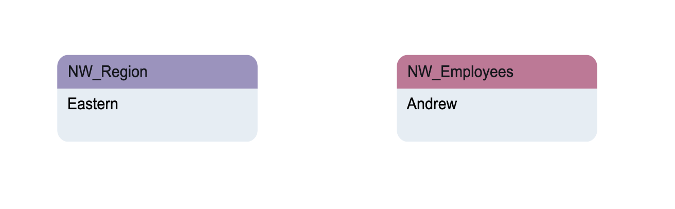
Resolve graph
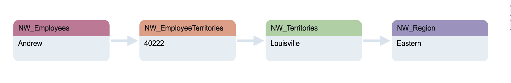
Resolve is located in the submenu of Add and will fetch all connecting nodes between the selected nodes. For example these two nodes are not directly connected but have some nodes in between that are not in the graph view yet.
Selecting both nodes and clicking on Resolve will pull in the connecting nodes and edges, resulting in this graph:
Arranging Nodes
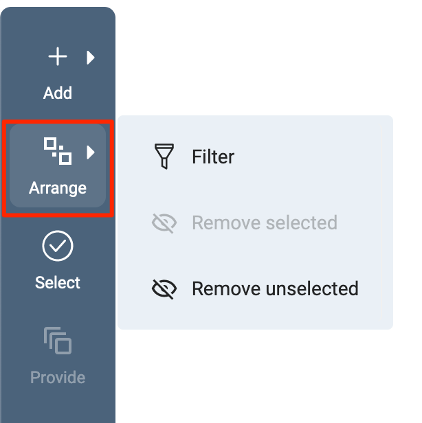
This menu is all about working with the existing nodes in the graph, filtering, selecting or removing them.
Filter Nodes
Similar to the Search Menu, Label and Property filters can be applied to nodes in the graph and set as a filter. If there are nodes that have been filtered via the node menu in the graph view they will be shown in the third tab "Filterd by selection". Once the filter is applied, a filter button and toggle will show up in the Top Menu Bar. Also the Number of Nodes indicator in the Top Menu Bar will additionally show the number of visible nodes. Filtering nodes will not remove them from the graph, the nodes will be temporarily hidden. The filter can be toggled on and off in the Top Menu Bar.
In the Arrange Menu, you can also choose to Remove selected or Remove unselected nodes from the graph.
Remove Selected Nodes
Remove selected or Remove unselected button will remove selected nodes them from the graph in contrast to applying filters which only hides them. This will create a history entry and the action can be undone. This action only affects the diplayed nodes in the frontend application, the nodes in the graph database will not be affected.
Select Nodes
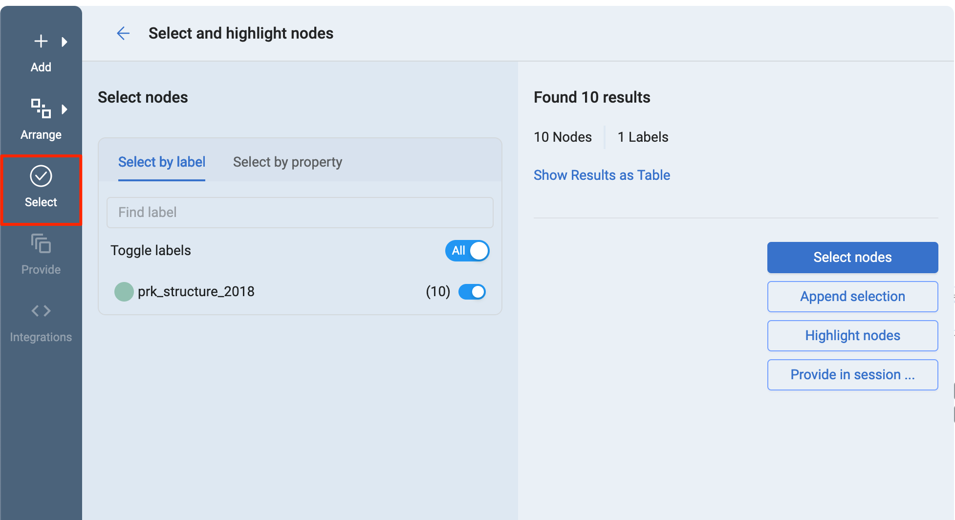
Similar to the Search Menu, it is possible to select nodes by filtering either by label or property and the results can be further refined in the Show Results as Table window. The resulting nodes can then be selected via Select nodes, appended to session with Append selection, highlighted with Highlight nodes or provided to another session tab with the Provide in session ... button.
Provide Nodes
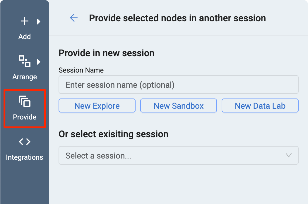
Selected nodes can be provided to other sessions (tabs). This way it is possible to add nodes to another Exploration Session, Sandbox or Data Lab. Nodes can be provided to a new or an existing session. Enter a title (optional) and click on one of the buttons to create a new session with New Explore, a New Sandbox or a New Data Lab with the respective buttons. To add the selected nodes to a saved Session, Sandbox or Data Lab, use the dropdown menu Select a session....
Integrations
Integrations are specific functions (code) defined on the node that can be executed in the frontend.
History
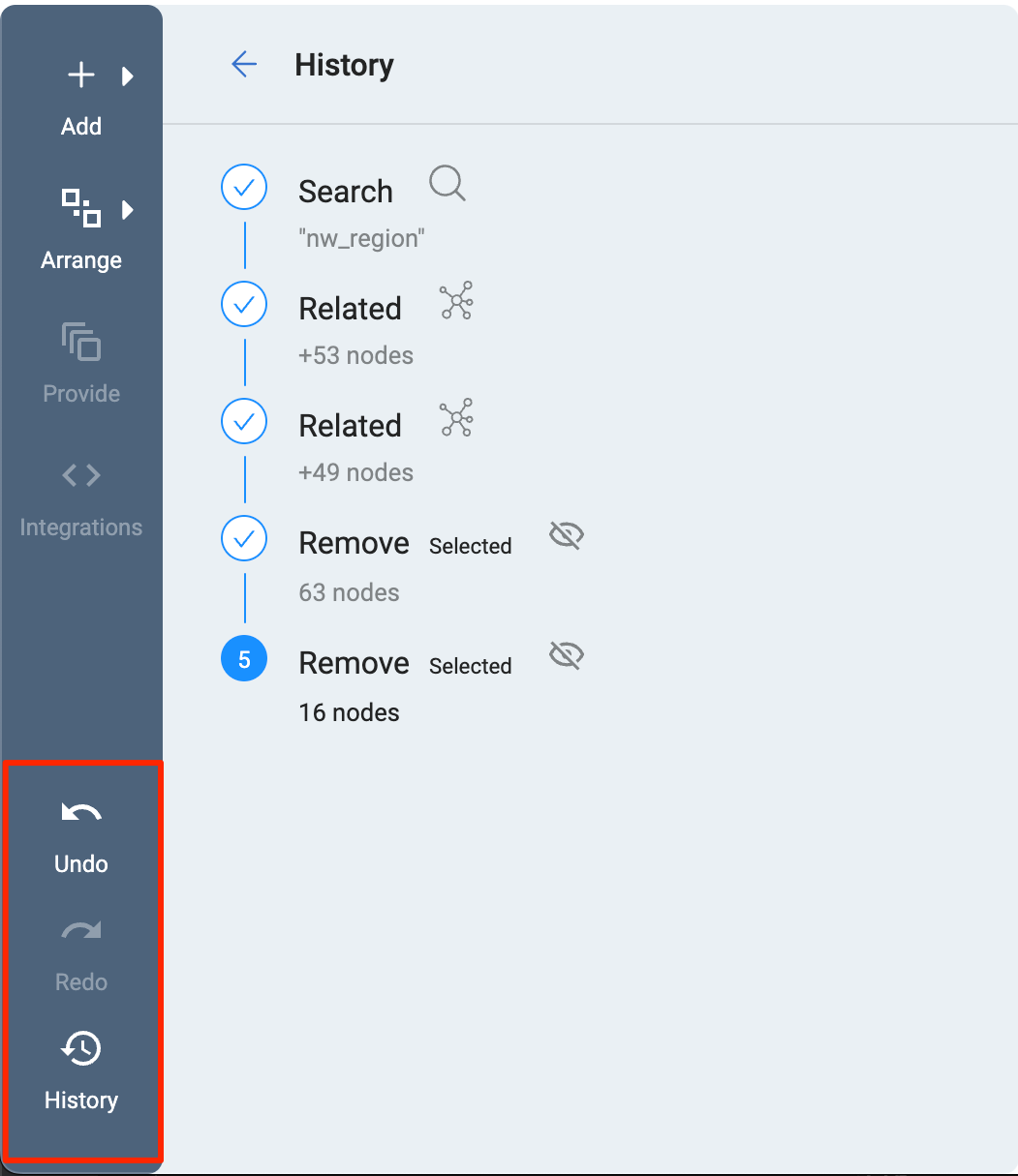
Any action that will change the graph by adding or removing nodes (except filtering) will create a history entry. Either use the Undo or Redo buttons or click on the History button to get a complete overview of all previous actions.
Top Menu Bar
The Top Menu Bar provides session specific actions and information.
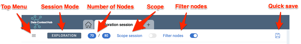
Top Menu
The Top Menu provides options to Save or Rename the active tab. In the dialogue opening when Save is clicked, self explaining Update or Save as New can be chosen. In other modes (Sandbox, Data Lab) more options are available.
Session Mode Label
Shows the current type of session (Exploration, Sandbox, Data Lab).
Number of Nodes Indicator
Shows the number of nodes in the graph. If a filter is set, it will show both the number of visible nodes and the number of all nodes including filtered in the current graph.
Scope
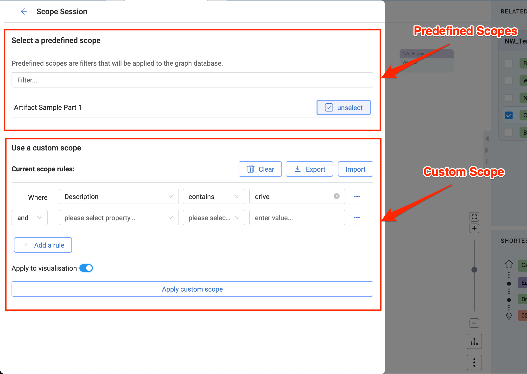
Scopes are more complex filters, and they differ from the normal node filter in how they are applied to the data.
- Predefined Scopes are a set of rules a data engineer can define in the Data Context Hub Backend Services. Once a predefined scope is selected in the Data Context Hub Frontend, it will be applied one each query the Frontend is performing, thus already pre-filtering the results the Frontend will receive.
- A custom scope is a set of rules the user can define. They work on node properties. Several rules can be chained by using boolean operators like "and" and "or". Rules can also be grouped together. Custom scopes are applied directly in the Data Context Hub Frontend. Besides having a more complex set of rules, the difference to the Node Filter is that the Custom Scope is applied already on the on the result of a query (eg. Search or Add related nodes query) instead of just filtering the nodes in the graph. Custom scopes can be toggled on and off in the Top Menu Bar as well as in the menu itself.
Filter
Clicking the Filter nodes button will open the Filter menu while clicking on the toggle right to the button will activate or deactivate the filter.
Quick save
Quickly save the session without opening the save menu. The session has to be saved at least once for quick save to work, otherwise the save menu will be opened instead. When the session is up to date and no changes have occurred, the icon will change to a checkmark instead.
Node Menu
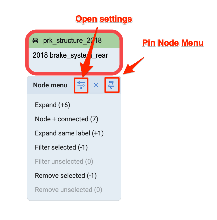
To open the Node menu right click on a single node or click anywhere if multiple nodes are selected. Clicking the Pin button will keep the Node menu permanentely open and pinned to the right corner of the Main Area.
All actions in the Node Menu are direct actions that will be applied immediately. Each action shows the number of nodes that will be added or removed from the graph.
- Expand adds connected nodes the same way as the Add Related Nodes Menu, with a sensitivity of 1.
- Expand incoming and outgoing further limits the results to incoming or outgoing connections (edges).
- Expand same label will only expand nodes of the same label.
- Node + connected will remove all other nodes except the selected node and the connecting nodes.
- Filter selected and Filter unselected will filter nodes from the graph. Open the Filter nodes menu to see all filtered nodes.
- Remove selected and Remove unselected will remove nodes from the graph.
All actions (except filtering nodes) create a history entry and can be undone in the History Menu in the Left Panel.
The Node menu can be customised by clicking on the Settings button that will open the Personalisation Settings.
Graph Controls
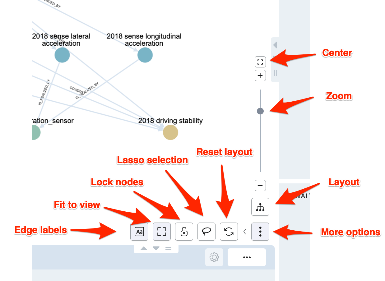
Press the three vertical points More Options button to display additonal options.
- Edge labels will toggle labels on the connecting edges on and off.
- Fit to view is enabled by default and will recenter and fit the graph into the view whenever there are some changes to the graph and the layout is reapplied.
- When Lock nodes is enabled, the layout algorithm will try to preserve the node positions when adding or removing nodes. This might result in overlapping nodes or a less than ideal layout. In that case, pressing the Reset layout button will rerender the whole layout.
- Enable Lasso selection to switch from the normal rectangle multi-selection to lasso selection, which gives you more control.
- Reset layout will reset the graph layout to its initial state. It will not change any data in the graph.
- Use the Layout button to switch between different Graph layouts and the Tree view layout.
- Further customisation options like mouse zoom sensitivity are available in the Personalisation settings.
Graph Layouts
To change the layout of the graph, press the Layout button from the Graph controls.
The default layout provides a hierarchial view on the data, it is best suited for DAGs (directed acyclic graphs). Depending on the structure and the amount of data, other layouts might perform better and provide different insights into the data.
- Hierarchical view: A hierarchical layout best suited for DAGs (directed acyclic graphs) and trees. It provides a well structured visualisation of most kinds of data with decent performance.
- By level view: The layout organises the nodes in levels by running a breadth-first search on the graph. It provides a less traditional result for DAGs than other layouts, but it uses space more efficiently and is considerably faster than other hierarchical laytous.
- Free view: A force-directed layout algorithm. It will display nodes in a semi-randomized layout, useful for identifying clusters of nodes.
- Circular view: A simple layout that will organize nodes in a circle, it helps to highlight the density of edges connected to different nodes.
- Concentric view: The nodes are placed in concentric circles. Nodes with a higher score (more connections) are placed in the middle, highlighting the relative importance of nodes.
Quick Search
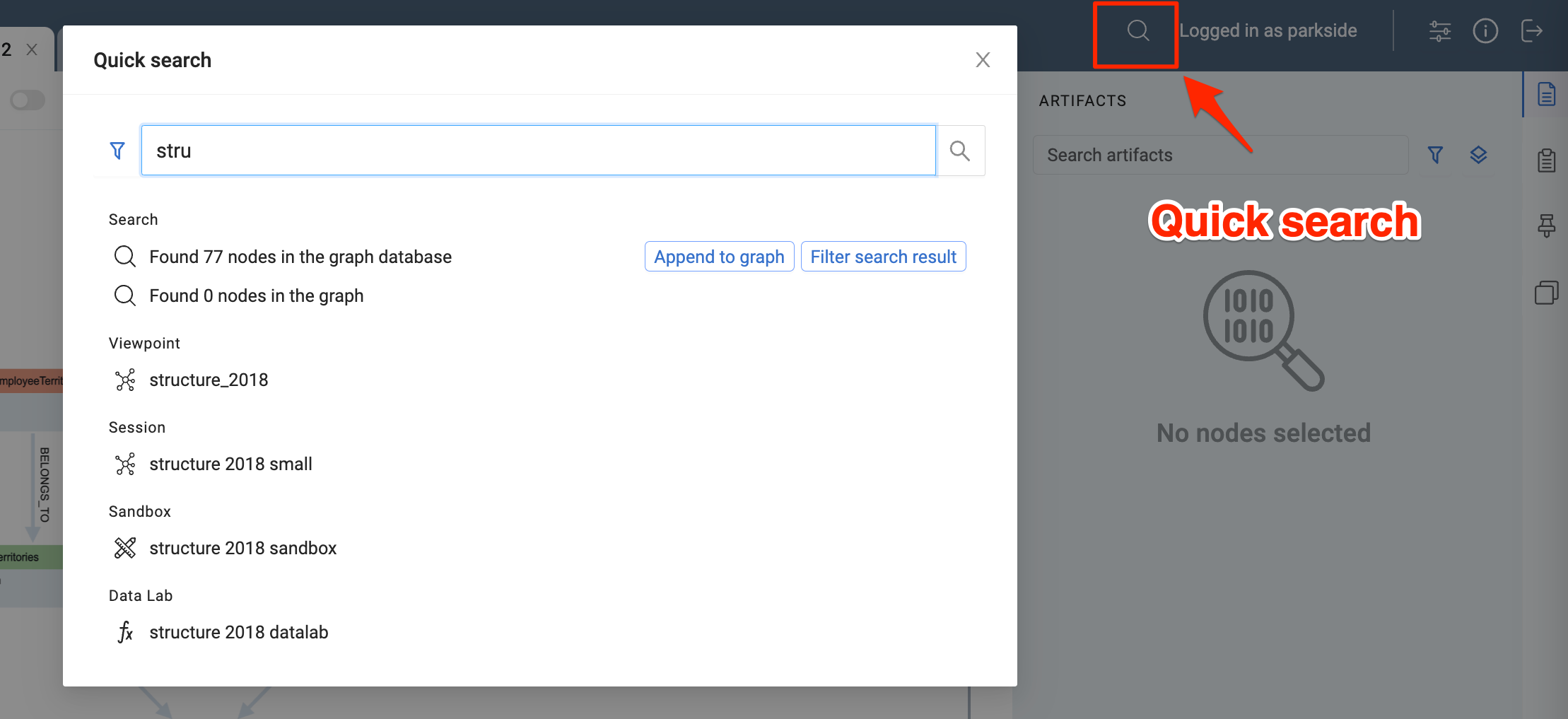
Press the Quick search button in the top right corner to open the Quick search dialog.
Quick search performs a number of operations once you type in a search term:
- Searches the graph database, you can add results directly to the graph or open the Search Menu for filtering.
- Searches for nodes in the currently displayed graph for selecting and highlighting.
- Searches all saved sessions. Sessions will be opened in a new tab.
Bottom Panel
The Bottom Panel has three tabs that provide information about node properties, related nodes and and the context of a selected node. Use the Expand / Collapse / Drag buttons to change the height of the panel.
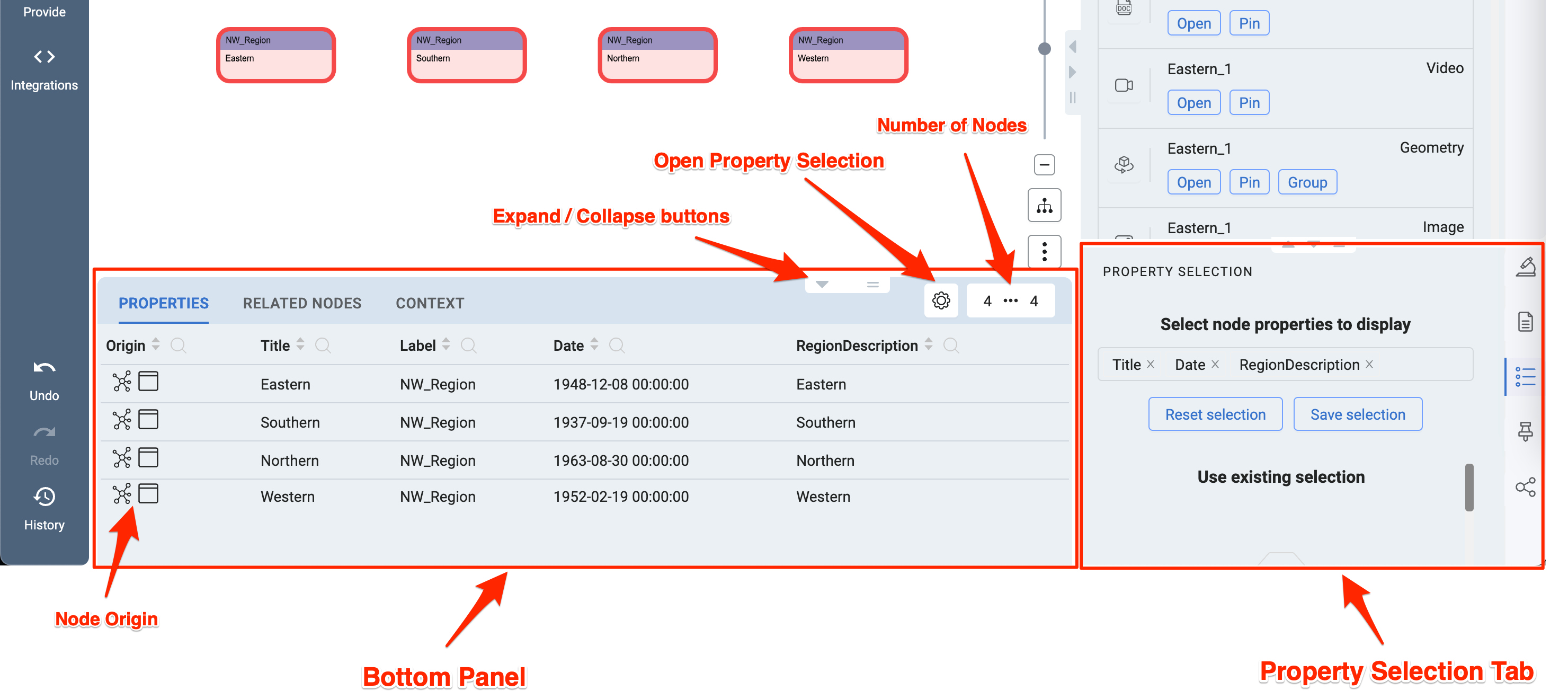
Node Properties Tab
The Node Properties Tab shows all properties of the selected nodes.
-
Node Origin explains the source of the selected node. A tooltip will appear on hover. The first icon depicts the location of the node - from the Graph database or created in the Sandbox. The second icon indicates the area where the node has been selected. In most cases nodes will be selected in the graph, but it is also possible to select nodes in the Label View and 3D Geometries - which will be explained later.
-
The Open property selection gear icon in the top right corner of the Bottom Panel, opens the Property Selection Tab to the right, where it is possible to select (filter) the properties that are displayed in the Properties table of the Bottom Panel.
-
Next to the Open property selection Settings gear icon is the Load more Button. It will indicate the number of all selected nodes and the number of number nodes currently displayed in the table. Only the first 25 nodes are loaded for performance reasons, to load more nodes press the button.
Related Nodes Tab
Similar to the Node Properties Tab, it will show nodes related to the selected nodes. You can select the nodes and add them to the graph or in a new session.
Context Tab
Depending on the selection, the Context Tab will show you information regarding the session or the selected nodes.
Right Panel
The Right Panel provides additional information on selected nodes. Use the tab bar on the right side to switch between tabs.
Artifacts Tab
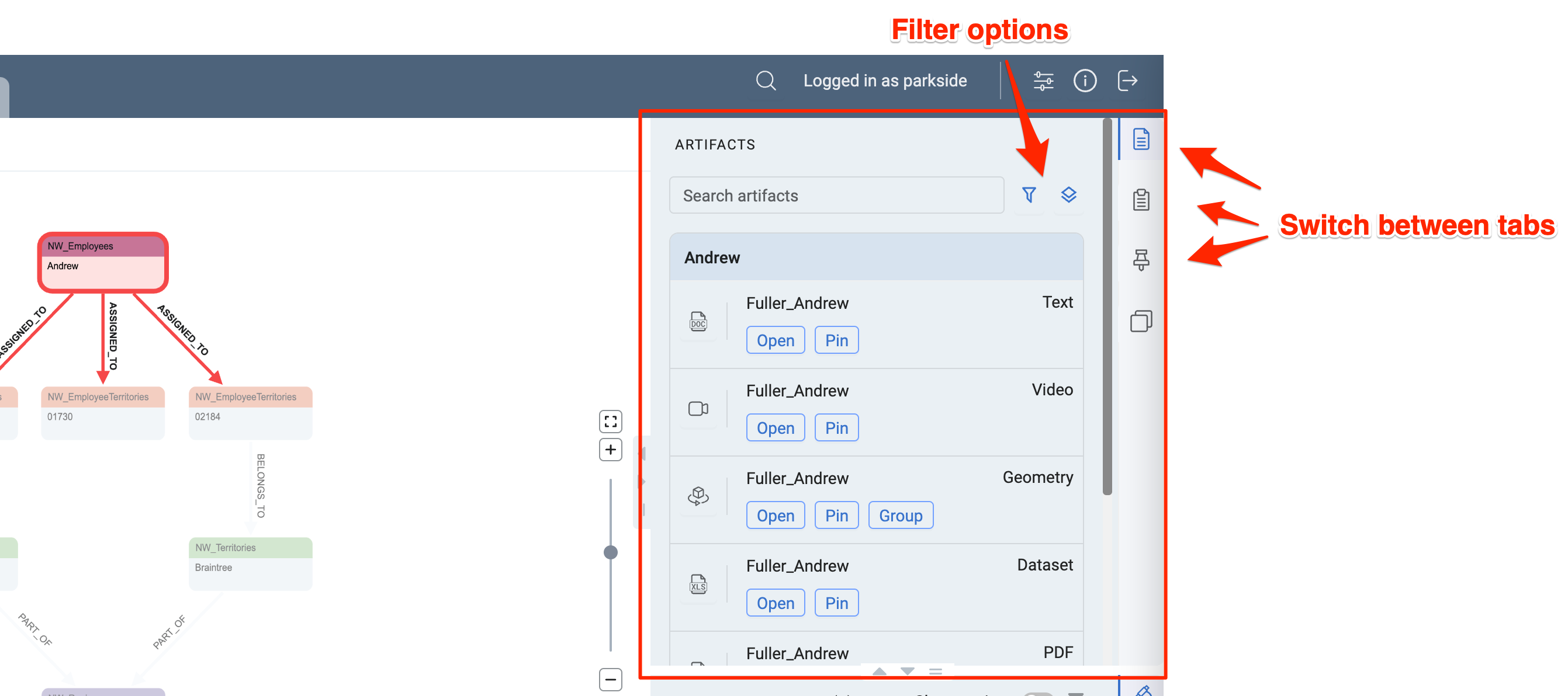
The Artifacts Tab displays artifacts belonging to the selected nodes. You can search for artifacts, filter them by type or group them either by node or artifact type.
- Open an artifact will open the media content in the Main Area. The graph will still be kept in the background, closing the artifact view will display the graph again.
- Applying Pin to an artifact will add it to the Pinboard Tab on pin icon on the right side of the artifact window.
Geometries are a special kind of artifact that will be displayed in the 3D Geometry viewer. Same as for other artifacts the viewer will be opened in a window in the Main Area. Geometry artifacts can be grouped together to open them as a group in the 3D Geometry viewer. Once geometries are grouped a new tab will appear where the grouped geometries are listed.
Supported artifact types are: Text (plain text document), Datasets (CSV files), PDF, Images (common formats), Videos (common formats), 3D Geometries
Node Properties Tab
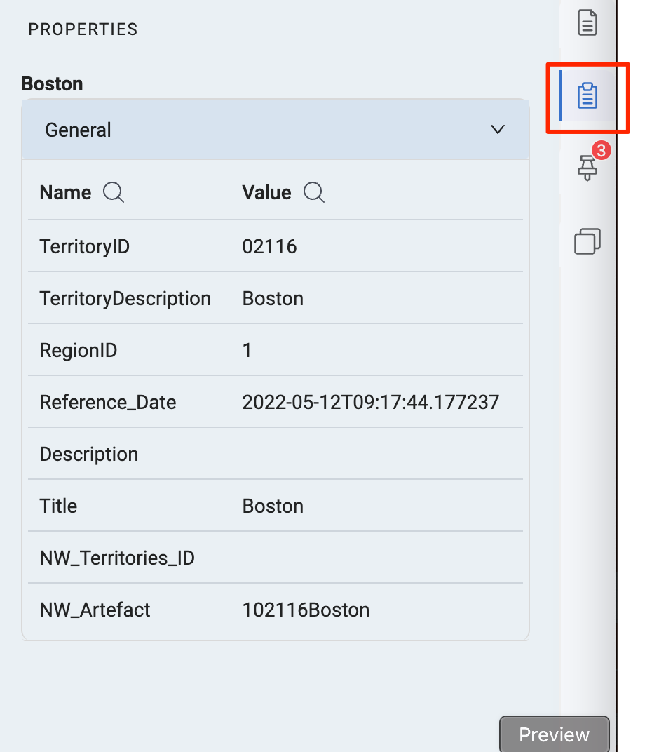
Similar to the Node Properties Tab in the bottom panel, only that the node properties are displayed in the form of a list. By default all node properties are displayed. Open the Properties Tab in the Bottom Right Panel to select (filter) which properties should be displayed.
Pinboard Tab
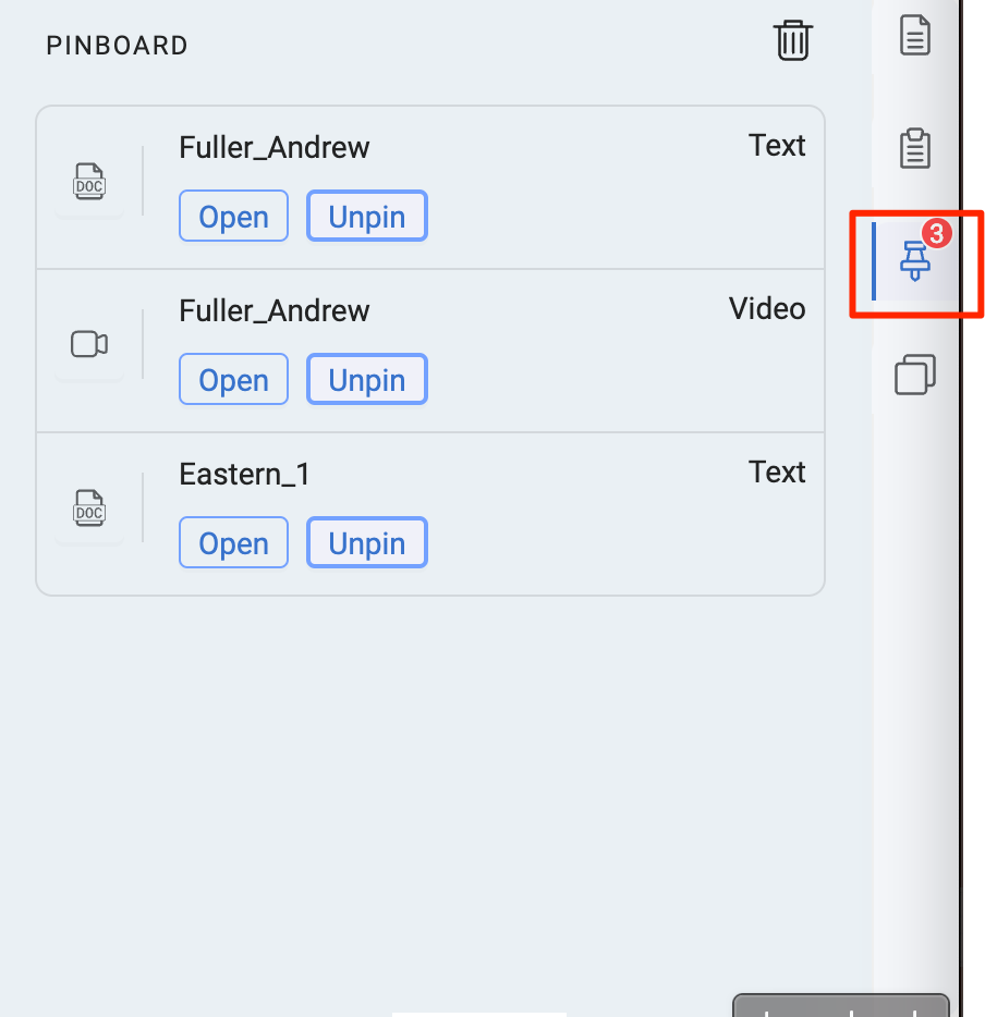
Displays a list of pinned artifacts. The trash bin button in the top corner will delete all pinned artifacts. Deleting a pinned artifact will not remove the artifact itself, it will only be removed from the Pinboard.
The Pinboard Tab is accessible from all session tabs, which makes it possible to share artifacts between sessions.
Label View Tab
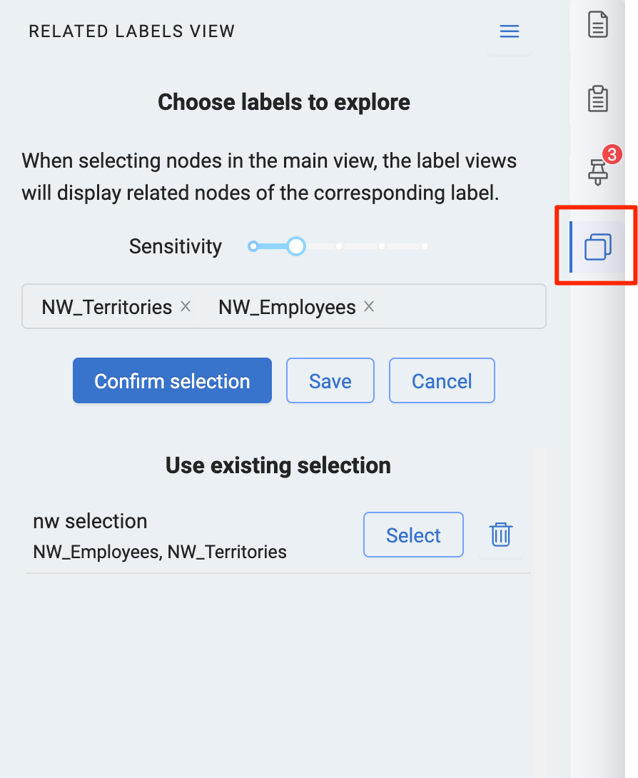
The Related labels view is a different approach to exploring related nodes. In the first step, select a number of labels. Once you select a node in the graph, the Related labels view will then display related nodes for the chosen labels.
Increase the sensitivity if you cannot find the label you are looking for.
It is also possible to save a label configuration.
Once you have selected a number of labels, confirm the selection and the Related labels view will be displayed.
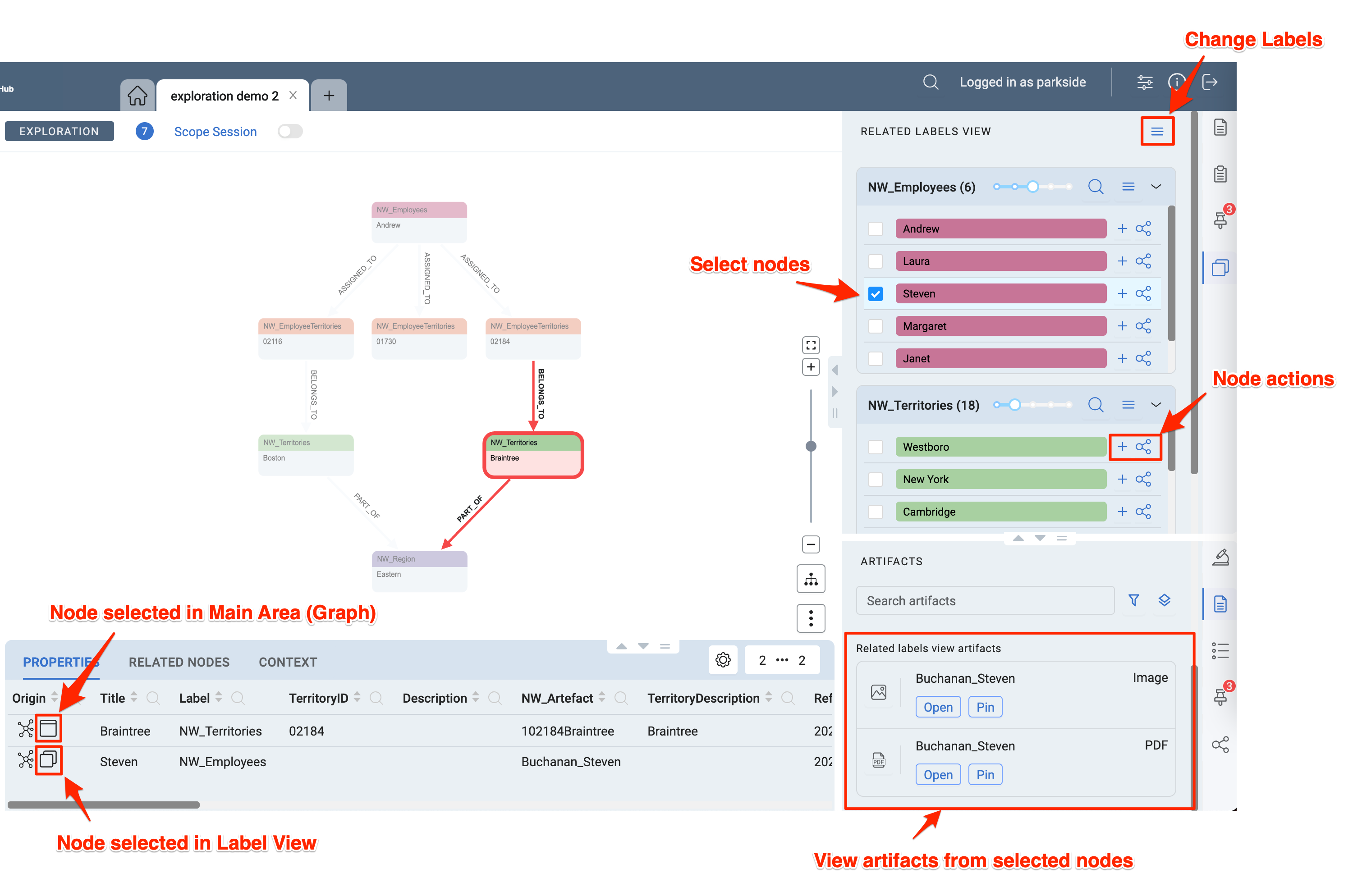
Use the menu in the top right corner of the Related labels view to get back to the previous view to change labels.
For each label selected, a Related labels view is displayed which shows related nodes to the selection in the graph. Use the slider to increase or decrease the sensitivity - same as when adding related nodes.
Use the checkmark to select nodes. Selected nodes from the Related labels view are treated in a similar way as selected nodes from the Graph. You can view node details in the Bottom Panel and you can use the Artifacts Tab in the Bottom Right Panel to view artifacts.
Use the node actions to either add the node and connecting nodes to the graph or to display the shortest path to the selected node in the Shortest Path Tab in the Bottom Right Panel.
Further actions like selecting all nodes are available in the Menu for each Related labels view.
Right Bottom Panel
The Right Panel is split into the main upper panel and Right Bottom Panel below. Both can be changed in size or minimized by using the Expand / Collapse / Drag button.
Some tabs like Artifacts Tab or the Pinboard Tab are available in both panels. They can interact with another like explained in the example with the Label View above.
A few more tabs are exclusively for the Right Bottom Panel.
Analysis Tab
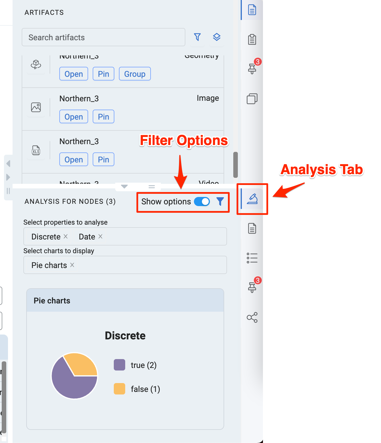
The Analysis Tab provides a quick summary and analysis of the selected nodes. For a more detailed analysis open a Data Lab with the selected nodes.
Press the toggle button to show filter options for the analysis.
Property Selection Tab
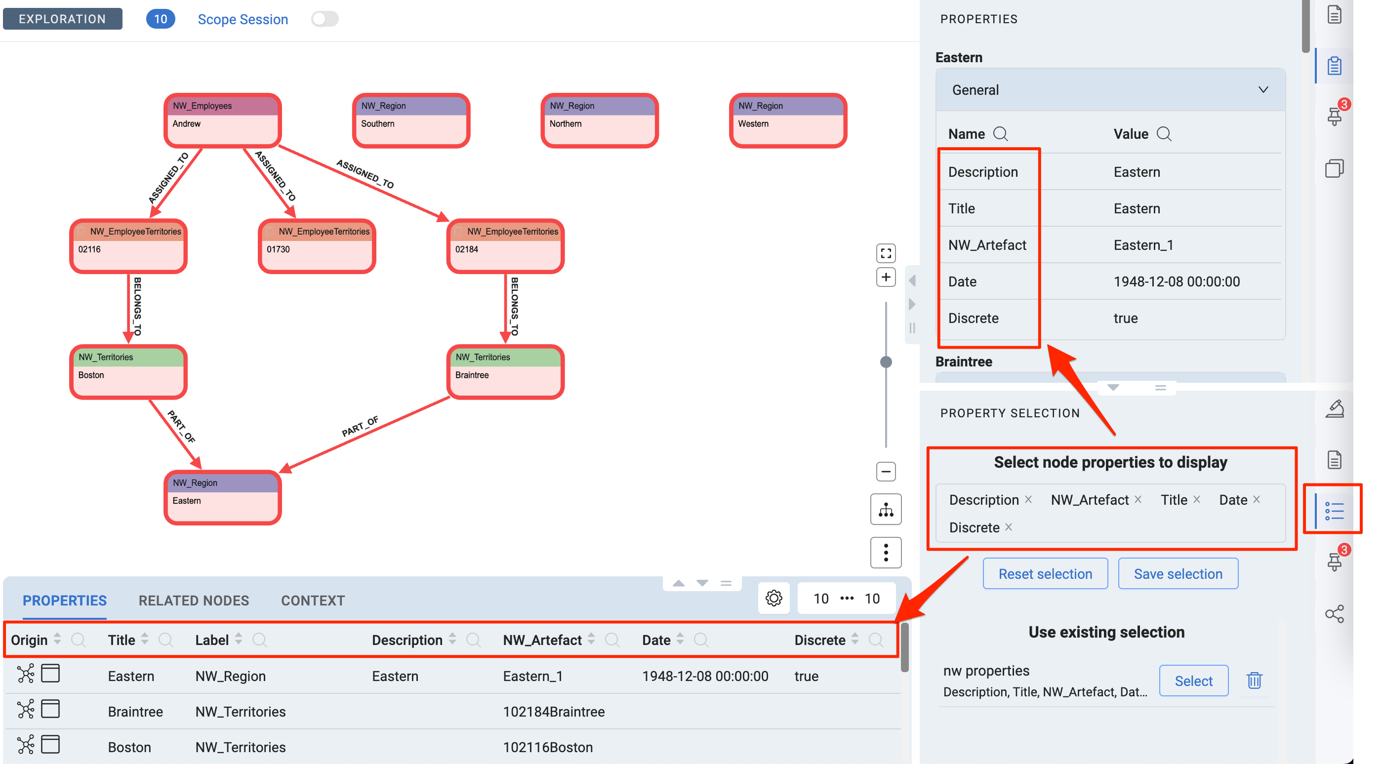
Open the Property Selection Tab either by clicking on the tab icon on the right side or by clicking on the settings icon in the Bottom Node Properties Tab.
Selected properties will be applied to both the Bottom Node Properties Tab and the one on in the Right Panel.
Property selections can be saved for reuse.
Shortest Path Tab
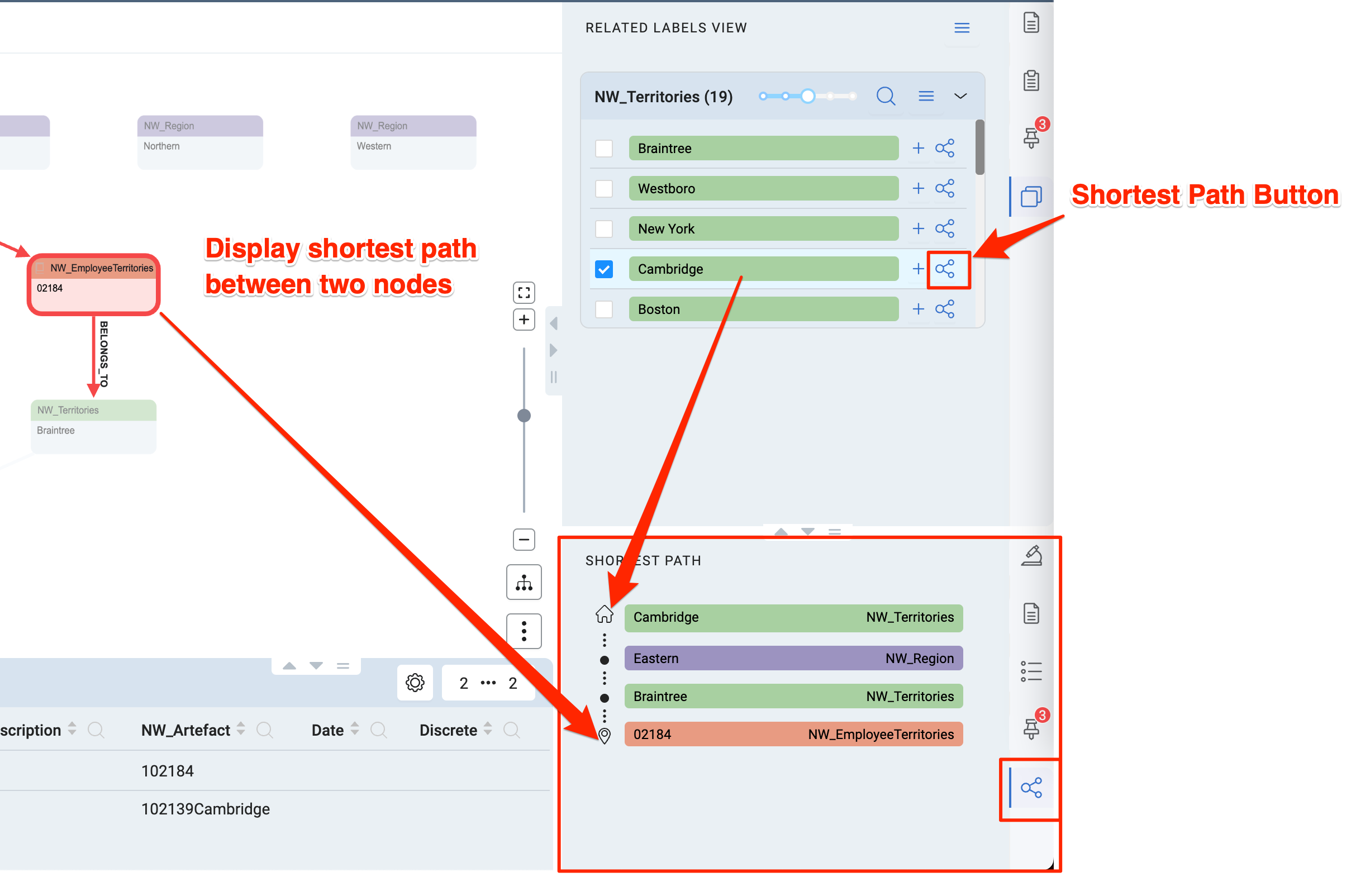
Select a single node in the graph and click the Shortest Path button on a node in the Related labels view. This will open the Shortest Path Tab and display the path from the start node (from Related labels view) to the node in the graph and the connecting nodes between.